Flex - (MacOs like) DockBar component

Components, Flex, actionscript 3

Some week ago for a project I was looking for a flex dockbar component. I found some but, the missing and most requested feature from users (and me too) was the ability to add items to the dockbar simply adding a mxml node so that click and rollover handlers, data bindings etc. could be easily implemented:

<DockBar>
   <Item click="doSomething()" rollOver="doOver" />
   <Item click="doSomethingElse()" rollOver="doOver" toolTip="click me" />
</DockBar>

I could not find anything similar, so I wrote this component.

I did zillions of experiments like this in the past, but I tried to do it easy to set up, and tried to use the less code possible.
I found suprisingly easy to build it upon the HBox and Image components. Maybe not the most sofisticated implementation but so damn simple…

With some good ideas flex can be really easy to code.

See it moving (just move the mouse to the last 20px on the bottom):

Example #1 - Basic implementation
Example #2 - Basic implementation applied to a ViewStack
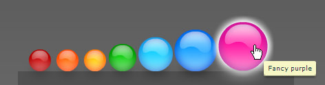
Example #3 - Tooltip, handcursor, rollover effects etc.

I need a component to place at the bottom of the screen so I hardcoded some params to place it but can be very easily tweaked.

Every example has view source enabled so just right click on it to view the code.

Here’s the code from example #1:

<local:DockBar id="dockbar" horizontalCenter="0" bottom="0" width="100%" height="100" minSize="32" maxSize="80">
		<mx:Label visible="false" id="menuLabel" text="Menu" bottom="0" horizontalCenter="0" fontSize="24" color="#ffffff" alpha=".75" />
		<mx:Canvas id="activationArea" width="100%" height="20" bottom="{-activationArea.height+20}" backgroundColor="#000000" backgroundAlpha="0" rollOver="dockbar.open()" />
		<mx:HBox id="innerCanvas" bottom="{-innerCanvas.height+20}" paddingLeft="{dockbar.minSize}" horizontalCenter="0" 
			backgroundColor="#333333" backgroundAlpha=".4" hideEffect="WipeDown" showEffect="WipeUp">
			<mx:Image click="clicked(1)" source="{icon1}" />
			<mx:Image click="clicked(2)" source="{icon2}" />
			<mx:Image click="clicked(3)" source="{icon3}" />
			<mx:Image click="clicked(4)" source="{icon4}" />
			<mx:Image click="clicked(5)" source="{icon5}" />
			<mx:Image click="clicked(6)" source="{icon6}" />
			<mx:Image click="clicked(7)" source="{icon7}" />
		</mx:HBox>
	</local:DockBar>

Do not remove the menuLabel and the activationArea elements. They was coded inside the actionscript of the component but then I moved them out to the mxml to make them easier to customize.

The activation area is the area to rollOver for the component to be opened (here 20px high… maybe 30 or 40 would be more confortable). The height of the dockbar instead is 100px and is the area to rollOut to make the component close.
Other parameters such minSize and maxSize are quite self-explanatory and limits the size of the icons.

The icons are embedded clips from a swf file. The registration point of the icons must be at the bottom-center.

Ths icons sizes are calculated based on horizontal and vertical distance. Many values are still hardcoded but could be easily parametrized.

You can try changing the backgroundColor and backgroundAlpha of the dockBar and the activation area to better understand how does it work.

Just leave a comment if you like it.
Bye

8 Responses

  1. alex  •  July 17, 2008 @12:49 pm

    where to download?

  2. Pierluigi Pesenti  •  July 17, 2008 @1:27 pm

    just right click on one of the three examples and click “view source”. A link to the zip is on the left frame.

  3. alex  •  July 17, 2008 @7:32 pm

    i think you realeased it without viewSource option in compiler because there isnt any viewSource in the example.
    otherwise you could add a link in your post to easy download.
    :D

    Thanks

  4. Pierluigi Pesenti  •  July 17, 2008 @11:30 pm

    Ops :-P

    Viewsource is enabled only in the first example.
    But from there you can see all the three files.

    Byez

  5. Og2t  •  July 28, 2008 @5:14 pm

    Hi Pierluigi!

    That’s excellent, thanks! I really like how you wrote dock mechanics in a few lines! It could be just so simple, hard to believe!

    Cheers, Tomek

  6. Pierluigi Pesenti  •  July 30, 2008 @8:32 am

    =) Thanks Tomek

  7. batchass  •  August 27, 2008 @6:35 am

    Ciao Pierluigi,
    I like this nice effect!
    could you share the icons.fla file? do you use the flex component.mxp for flash?
    Can I use it on my website?
    Grazie

  8. Pierluigi Pesenti  •  September 2, 2008 @8:23 am

    Sorry batchass for replying just now, but didn’t notice the e-mail for this comment.

    1. http://blog.oaxoa.com/wp-content/icons.zip

    2. I rarely used flex components for Flex
    3. You can use it wherever you want. It’s why I published it :)

Leave a Reply

Allowed tags: <a href="" title=""> <abbr title=""> <acronym title=""> <b> <blockquote cite=""> <cite> <code> <del datetime=""> <em> <i> <q cite=""> <strike> <strong>